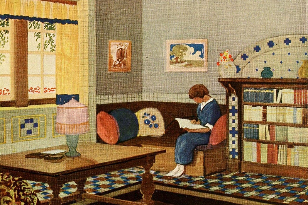
When you’re shopping for a new phone cover or for kitchen backsplash tiles, it goes without saying that you can expect to find a dazzling array of colorful options. As art historian Stephen Eskilson explains, that profusion of color in American design emerged quite suddenly in the first decades of the twentieth century.


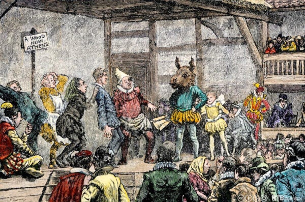
Around the turn of the century, Eskilson writes, theaters began adopting “expressionist lighting,” using colored lights to add emotional depth to a performance. American dancer Loie Fuller helped popularize the practice, choreographing vertical shafts of light that changed color rapidly as dancers in gauzy costumes twirled within them.
Meanwhile, the theosophist movement promoted the idea of color as a spiritual medium. In the 1901 book Thought-Forms, theosophist leader Annie Besant argued that mental states could be translated directly onto the color spectrum.
Soon, some visual artists also began exploring pure color, coining the term “synchromism” as a visual equivalent of “symphony” to describe their work.
“Mankind has, until now, tried to satisfy its need for the highest spiritual exaltation only in music,” one synchromist wrote. “Yet color is just as capable as music of providing us with the highest ecstatices and delights.”
Architects got in on the fun, Eskilson writes, adopting colorful terra cotta, ceramic tile, and dyed concrete for art deco buildings. The invention of the sprayed color lamp in 1922 allowed for the nighttime illumination of buildings with spotlights and floodlights in a range of colors.
In 1923, DuPont invented a quick-drying lacquer product known as Duco that allowed for the expansion of colorful cars beyond the luxury market. Even Henry Ford, famous for the quip that customers could get the Model T in any color, so long as it was black, caved to the color craze. An advertising campaign for the Model A promised that customers would “be delighted with its low, smart lines and the artistic color combinations. There, you will say, is a truly modern car.”
Eskilson writes that color ads—sometimes the only pages printed in color in otherwise black-and-white publications—showed off the tones of new consumer products, from kitchen appliances to lamps. Paint company Sherwin-Williams even proposed that homeowners repaint their homes twice a year, with warm colors in winter and cool ones in summer.
Bright lipsticks and rouge replaced makeup designed to imperceptibly improve women’s looks. Manufacturers sold coffee and shampoo in colorful packaging. Trains and planes adopted new color schemes. Businesses bought color wheels and consulted the writing of academic psychologists, who waxed eloquent on the psychological effects of various color combinations.
Weekly Newsletter
In 1928, the Saturday Evening Post published a commentary announcing a “chromatic revolution.”
“The craze for colored glassware for table and parlor use has produced new hues and effects,” it said. “Motor cars are borrowing their hues from the waters of the Nile, and the sands of Arabia, the plumage of birds and the fire of gems.”
Today that enthusiasm for color still echoes when we buy new products, carefully choosing between jade, plum, and flax.
Support JSTOR Daily! Join our new membership program on Patreon today.


_(14595411500).jpg)